Working with sampling
The way sampling worked until now was that if you chose some sampling option, for example, 1-month sampling, and this option had more than 30 values, the chart would be automatically smoothed (it would be a trend chart). This means that it automatically eliminated extremes from your chart.
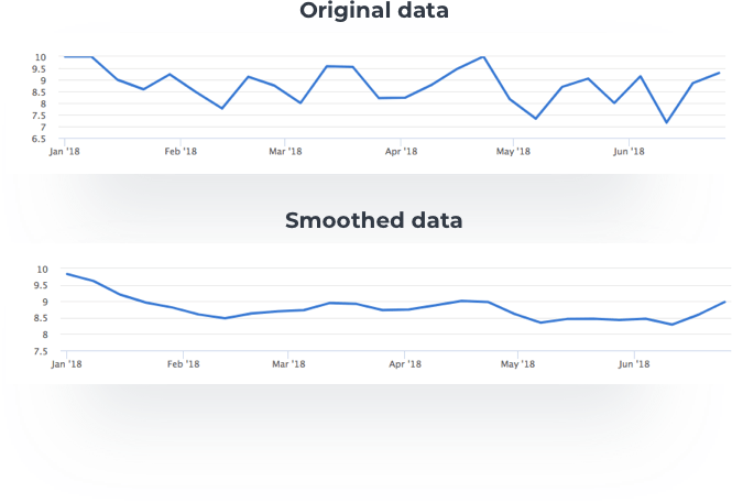 With the analytics update, you will now be able to decide which kind of chart you want to see – smoothed or original (raw). There will be this option for each sampling period. For example, if you’ll want to see 1-month sampling you will be able to choose between 1-month sampling or 1-month sampling smoothed.

1-week sampling
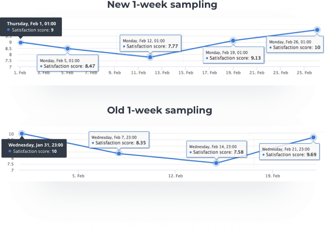
Another update will affect 1-week sampling data. if you chose 1-week sampling in your dashboard before this update the chart was divided into 7-day sections. Let’s say that you wanted to see a 1-week sampling from Tuesday 31.7. So Nicereply created a chart that showed data from 31.7., then the next point was Tuesday 7.8., then Tuesday 14.8. and so on. The problem was that the data was not in accordance with the workweek.
From now on it will work differently. The first point (date) you want to see your data from can be any day of the week, as it was before. The difference is that the next point (date) is always a Monday, so you will be able to see the data for each workweek. So again imagine you choose a 1-week sampling from Tuesday 31.7... The chart will show data from 31.7., then the next point is Monday 6.8., then Monday 13.8. and so on.